
Styling Tips
How to Build a Cohesive Color Palette for Your Home
26 March 2026 · By Arwa
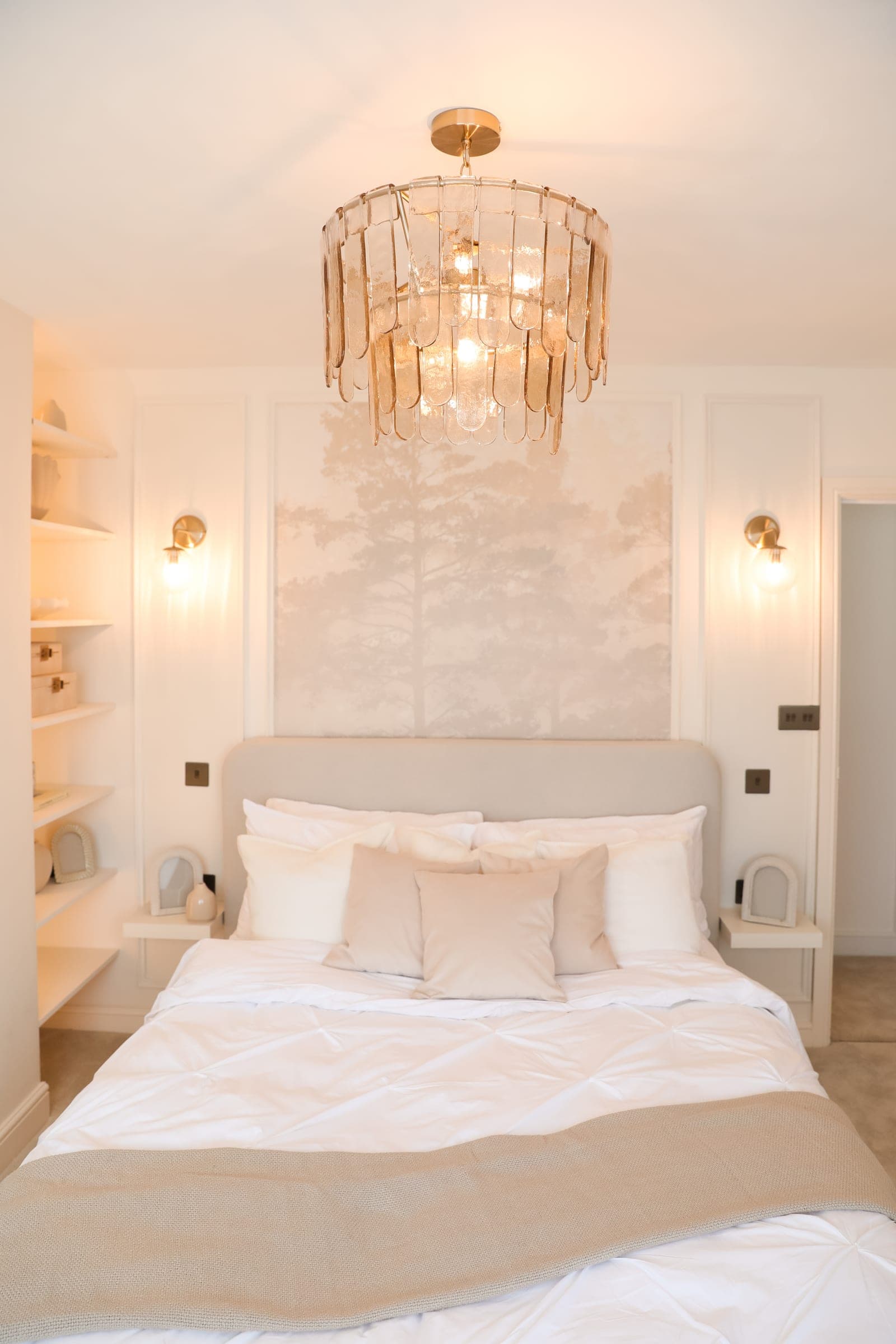
It can make a room feel warmer, brighter, calmer, more intimate, more sophisticated, or more energetic. It can also create a sense of connection between spaces, even when each room has its own personality.
But choosing a colour palette is often more complicated than finding a few shades you like.
You may love a paint colour online but discover that it looks completely different in your home. You might choose beautiful furniture and accessories individually, yet something still feels disconnected when everything is brought together.
Often, the problem is not the individual choices.
It is the lack of a clear colour strategy connecting them.
A cohesive colour palette gives your home a visual foundation. It helps different materials, furniture, finishes, and rooms relate to one another so that the overall design feels intentional rather than accidental.
Here is how to create a colour palette that feels balanced, personal, and cohesive throughout your home.
Step 1: Decide How You Want Your Home to Feel
Before looking at paint samples, start with atmosphere.
Ask yourself:
How do I want to feel when I walk into my home?
This question is often more useful than asking which colours are currently popular.
If you want your home to feel calm and restorative, you may naturally gravitate towards soft neutrals, muted greens, warm whites, and gentle earthy tones.
If you prefer something clean and contemporary, you may be drawn to crisp neutrals, soft greys, deeper accents, and stronger contrasts.
For a warmer and more inviting atmosphere, beige, taupe, terracotta, natural timber, cream, and other earth inspired tones can work beautifully.
Your palette should support the atmosphere you want to create.
Start With Descriptive Words
Before choosing actual colours, choose three or four words that describe your ideal home.
For example:
Warm. Calm. Natural. Timeless.
Or:
Contemporary. Sophisticated. Clean. Dramatic.
These words become your design filter.
When considering a new colour, material, or piece of furniture, ask whether it supports that overall feeling.
This helps prevent your palette from changing direction every time you see something new that you like.
Step 2: Understand Your Existing Home
Your colour palette should not be developed in isolation from the property itself.
Look at what is already there.
Consider your flooring, doors, windows, architectural details, kitchen finishes, stone, existing furniture, and any permanent elements that you are not planning to replace.
These features already contain colours and undertones.
Your new palette needs to work with them.
For example, if your flooring has a warm undertone, introducing several cool greys may create an uncomfortable visual contrast.
Likewise, a cool stone finish may need a different white than a room filled with warm timber.
Good colour selection begins by understanding what the room is already telling you.
Step 3: Choose Your Base Colour
Your base colour creates the foundation of the palette.
It is usually the most dominant colour and may appear across large surfaces such as:
- Walls
- Flooring
- Large furniture
- Cabinetry
- Curtains
- Architectural finishes
Common base colours include warm white, beige, taupe, soft grey, cream, or another subtle neutral.
However, your base does not necessarily have to be extremely pale.
A deeper neutral can also work beautifully if it suits the size, lighting, and atmosphere of the room.
The important thing is that your base gives you enough flexibility to introduce other colours and materials without creating visual competition.
Do Not Choose White Without Thinking About It
White is often treated as the safest option.
But there are countless variations of white.
Some have yellow undertones.
Others lean towards pink, grey, blue, or green.
The right white can make a room feel beautifully balanced.
The wrong one can make your other materials suddenly appear too yellow, too cool, or slightly disconnected.
Treat white as a colour rather than an automatic default.
Step 4: Pay Attention to Undertones
Undertones are one of the most important parts of creating a cohesive colour palette.
Two colours may both appear beige at first glance, but one may have a pink undertone while another leans yellow or grey.
Place them together and the difference becomes much more obvious.
This is why rooms sometimes feel slightly wrong even when you cannot immediately identify the problem.
The colours are not necessarily unattractive.
Their undertones are simply competing.
When selecting paint, fabrics, flooring, stone, cabinetry, and furniture, compare samples next to one another.
You are looking for colours that communicate rather than compete.
Step 5: Add Supporting Colours
Once your base has been established, supporting colours create depth.
These tones can appear through:
- Rugs
- Curtains
- Upholstery
- Accent furniture
- Joinery
- Bedding
- Occasional walls
- Larger decorative elements
Supporting colours should be noticeable enough to create interest while still allowing the base colour to dominate.
For example, you might combine:
Warm beige + olive green + cream
Or:
Soft grey + dusty blue + warm white
Or:
Warm white + terracotta + sand
These combinations work because the colours share a relationship.
Rather than asking whether two colours are beautiful individually, ask whether they make sense together.
Step 6: Introduce Accent Colours With Restraint
Accent colours give your interior personality and contrast.
They are usually the strongest colours within the palette, which means they do not need to appear everywhere.
You might introduce an accent through:
- Cushions
- Artwork
- Decorative objects
- Lamps
- Smaller furniture pieces
- Accessories
- Selected textiles
A deep navy can bring depth to a neutral room.
Burnt orange can add warmth to an earthy palette.
Black can provide definition and structure within a contemporary interior.
A muted green can introduce a subtle connection to nature.
The important word here is restraint.
When every object becomes an accent, nothing feels like an accent anymore.
Step 7: Use the 60 30 10 Rule as a Guide
The 60 30 10 rule is a useful starting point when you are unsure how much of each colour to introduce.
Traditionally, the balance looks something like this:
60 percent: Your dominant or base colour
30 percent: Your supporting colour or colours
10 percent: Your accent colour
For example, a living room might have warm neutral walls and a large neutral sofa forming the majority of the palette.
A secondary tone might appear through curtains, a rug, and occasional furniture.
Then a deeper accent could be introduced through artwork, cushions, or decorative details.
However, this should be treated as a guideline rather than a strict mathematical formula.
A beautifully designed room does not need to follow exact percentages.
The principle is simply to establish visual hierarchy so that every colour is not competing for equal attention.
Step 8: Use Texture Before Adding Another Colour
When a room feels flat, the instinct is often to introduce another colour.
But sometimes the room does not need more colour.
It needs more texture.
A neutral palette can feel incredibly rich when different materials are layered thoughtfully.
Consider combining:
- Linen
- Wool
- Timber
- Natural stone
- Boucle
- Cotton
- Plaster finishes
- Woven materials
- Brushed or aged metals
Imagine a room using several shades of cream and beige.
If every surface is smooth and similar, the space may feel flat.
But introduce linen curtains, timber furniture, a wool rug, textured upholstery, natural stone, and subtle metal details, and suddenly the same limited colour palette feels layered and sophisticated.
Texture creates visual interest without disrupting cohesion.
Step 9: Consider Materials as Part of Your Colour Palette
Colour does not come only from paint and fabric.
Timber has colour.
Stone has colour.
Metal has colour.
Flooring has colour.
Even natural materials have undertones that influence the overall room.
When developing your palette, place material samples alongside your paint and fabric selections.
Look at the complete composition rather than choosing everything separately.
Your flooring, worktops, joinery, furniture, textiles, and walls should feel as though they belong to the same visual story.
This is particularly important in open plan homes where several materials can be visible at once.
Step 10: Create Flow Between Rooms
A cohesive home does not mean every room needs to use exactly the same colours.
In fact, repeating the same palette identically throughout the entire property can make the design feel predictable.
Instead, create continuity.
You might use the same warm neutral base throughout the main living areas but introduce different supporting colours in each room.
Perhaps olive green appears strongly in one room and more subtly through artwork or textiles in another.
A timber tone used in the kitchen could reappear through furniture elsewhere.
A metal finish could be repeated through lighting and smaller details.
These subtle connections help the home feel considered as a whole.
Think About What You Can See From One Room to Another
Stand in a doorway and look through your home.
Which rooms are visible at the same time?
Those spaces should communicate with one another visually.
They do not need to match, but there should be something connecting them.
This is particularly important for hallways, open plan spaces, and adjoining living areas.
Step 11: Consider Natural Light
The same paint colour can look completely different from one room to another.
Natural light changes throughout the day and depends on the orientation of your home, window size, surrounding buildings, and even the weather.
A colour that looks warm and soft in one room may appear cooler or duller somewhere else.
This is why selecting colours from a photograph, website, or small paint card is risky.
You need to see the colour within the actual space.
Step 12: Test Colours Before Committing
Never underestimate the importance of testing.
Apply generous samples and observe them at different times.
Look at the colour:
- In morning daylight
- During the afternoon
- On bright days
- On overcast days
- Under artificial lighting
- In the evening
Also place the sample near your flooring, furniture, curtains, stone, or other major finishes.
A colour does not exist independently.
Its appearance is influenced by everything surrounding it.
Give yourself time to observe it before making the final decision.
Step 13: Think About Artificial Lighting Too
Your home does not only exist during daylight hours.
Artificial lighting can dramatically change how colours appear.
Warm lighting can enhance earthy tones and warmer neutrals.
Cooler lighting can alter those same colours and make them appear different from how they looked during the day.
This is another reason lighting and colour should not be designed separately.
Your paint palette, materials, and lighting temperature should work together to create the atmosphere you want.
Common Colour Mistakes to Avoid
Using Too Many Colours
More colour does not necessarily create more personality.
Too many competing shades can make the room feel unsettled.
Choose a clear palette and allow variation to come through tone, material, and texture.
Mixing Warm and Cool Undertones Without Intention
Warm and cool colours can absolutely work together, but the combination needs to be deliberate.
Randomly mixing undertones can make finishes look disconnected.
Choosing Paint Before Other Major Finishes
Paint is one of the easiest elements to customise.
Flooring, stone, furniture, and cabinetry often have fewer options and are more expensive to change.
Consider the major fixed elements before finalising your paint.
Following Trends Without Considering Your Home
A trending colour may look beautiful online but still be wrong for your architecture, lighting, or personal style.
Your home should outlive a trend cycle.
Ignoring Texture
If your neutral room feels boring, adding another strong colour may not be the solution.
Introduce tactile variation first.
Choosing Every Colour Separately
A beautiful paint colour, beautiful sofa, and beautiful rug do not automatically create a beautiful room.
Always evaluate them together.
A Cohesive Palette Does Not Have to Be Boring
There is sometimes an assumption that cohesion means using only beige, white, and neutral colours.
It does not.
A cohesive interior can be colourful, dramatic, dark, playful, or highly expressive.
Cohesion simply means that the colours have been selected intentionally and have a clear relationship with one another.
You could build an entire scheme around deep greens, blues, warm reds, or richer earthy colours.
The principle remains the same.
Create a foundation.
Understand the undertones.
Establish hierarchy.
Repeat colours intentionally.
And make sure the palette works with the architecture, materials, and lighting of your home.
Final Insight
A successful colour palette is not about finding the perfect individual shade.
It is about creating relationships between colours, materials, textures, lighting, and spaces.
Start with how you want your home to feel.
Understand the existing elements you need to work with.
Choose a strong base.
Introduce supporting colours thoughtfully.
Use accents with restraint.
Layer texture.
Test everything in the actual space.
And create subtle connections as you move from room to room.
When these decisions are made intentionally, colour does more than make your home look beautiful.
It creates rhythm, atmosphere, and a sense of belonging throughout the entire space.
The goal is not to use more colour. It is to use colour with purpose.
Enjoyed This
Let's Talk About Your Home
Book a consultation with Babylon Design Studio and start your project with clarity, from layout to final styling.
Book a Consultation